They say if it ain’t broke, don’t fix it.
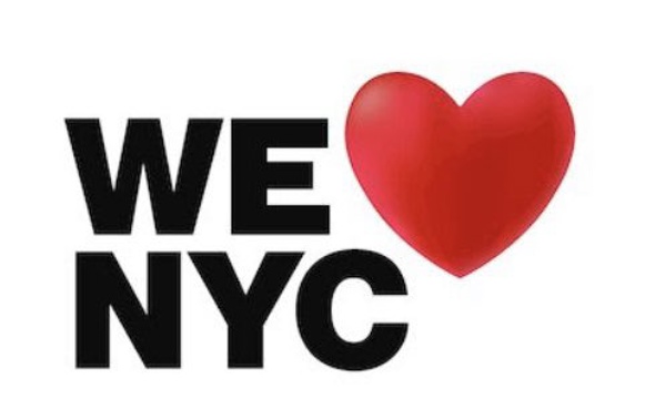
And yet, despite being instantly adored by New Yorkers and then loved by the world for almost 50 years (so, evidently not broke), one organisation decided the I [heart] NY logo needed an update.
On Monday, the Partnership for New York, a collection of businesses and wealthy individuals dedicated to promoting the city as a hub of commerce, culture and innovation, revealed a new logo for the big apple.
Let’s just say, it didn’t receive quite the same warm fuzzy response as Milton Glaser’s one in 1977 when, after a bankruptcy scare and an increase in crime, the state department of commerce hired advertising agency Wells Rich Greene to develop a campaign to promote the city as a tourism destination. Glaser was recruited to design a logo to accompany it.
/cloudfront-ap-southeast-2.images.arcpublishing.com/nzme/CQACQEJHWRCQLN25BCIPDWIO2M.jpg)
The logo has been replicated countless times, most popularly, on teeshirts. Photo / Billie Grace Ward, Wiki Commons
Assuming the campaign would be short and simple, Glaser allegedly designed the logo for free and sketched the first design using crayon and scrap paper while riding a taxi to a meeting about the campaign.
Decades later, the logo’s American Typewriter letters and the red heart are still used around the city and - often illegally - the wider world.
The Partnership told the New York Times they wanted to honour Glaser’s design “but push it in a different direction” and “give it more of a modern twist”. This involved changing the font to Helvetica, one of the world’s best-known fonts and which is used on the city’s subway signs, and changing the heart to mimic an emoji heart.
When New York Times reporter Emma Fitzsimmons shared the new logo on Twitter on March 21, people were not shy about sharing their honest - and brutal - opinions.
“Font good, design NO,” one Twitter user simply replied.
“I wouldn’t wish this on Jersey,” another joked.
One person shared a photo of the old logo with the caption; “Milton Glaser got it right the first time.”
Another created a satirical poll that asked people to guess how the logo was created, with options such as Microsoft Paint, Microsoft Powerpoint, Instagram Stories and Canva.
Others criticised how the new logo seemed superficial.
“Feels emoji-like and lacks anything that feels timeless or iconic,” one user wrote.
Of course, a new logo probably won’t have the same depth or history as one that is decades old, which begs the question: why change?
Sure, the novelty makes it attention-grabbing but this seems to be where the advantage of newness ends.
Unlike the classic logo, which carried a tapestry of meaning made over decades of use, the new design’s chunky san serif letters and familiar emoji heart are so “on trend” it slips silently into today’s wider design landscape, seeming most powerful in its ability to remind locals just how much they loved the old one.
Take your Radio, Podcasts and Music with you


