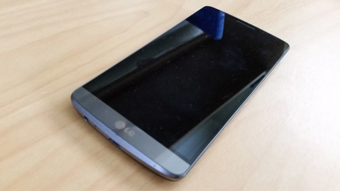
One of the spin-offs of reviewing the G Watch R in my previous post, was I also got to play with LG's flagship handset, the G3.
As I confessed last week, until recently I wasn't even aware LG made phones at all, let alone a whole range of them. After spending a fair amount of time with the G3, I can tell you they seem to know what they're doing.
The G3 is a beautifully elegant thing to hold. The back cover curves to almost nothing at the edges and although it's plastic, the compound and finish LG uses has a metallic feel. Flip it over and you'll be impressed by the way the screen seems to stretch right out to the sides, with very little blank space. This means the overall size of the handset is a little smaller than the Samsung GS5 for example, while the screen is actually a bit bigger.
This is significant, as due to the large display, you'll get many of the benefits of a phablet like the Note 4, while still being able to fit the G3 in your pocket. Another way LG has reduced the size of the phone without affecting the functionality is by moving the home touch buttons off the bottom of the phone and putting them virtually on the display itself. What's more, they can be set to disappear; you just swipe them back when you need them. What's even more, they're customisable. You can change the order and the colour, you can even have 5 if you want, adding shortcuts like Notifications, QuickMemo+, QSlide or DualWindow.
Again, like Samsung's Galaxy Note 4, those last two options are all about making good use of the large display, giving you access to 2 apps on screen at the same time. The stock email app also displays messages in my preferred format, with a list of messages on one side and previews shown on the other.
Given most of the apps I was using worked better in landscape mode, I found it odd the home screen wouldn't display in landscape mode by default. On a phone where almost everything can be customised, strangely I had to download a 3rd party app to get my icons to turn around. Weird, but not a major.
There are two things that really make the G3 unique, but for the life of me, I can't decide if I like them or not. Due to the G3's skinny edges, there are no physical buttons to be found on them. Instead, the volume controls and on-off button have been nestled under the camera lens on the back. While this means you won't accidentally push them while handling the phone, because you use them without looking at them, I often found myself pressing the wrong one or the camera lens itself.
LG's other unique quirk is the Knock Code you can use to unlock or wake the phone. Rather than a pin number, a fingerprint or facial recognition, the G3 lets you choose your own knock, and you just tap the screen with the code.
Amazingly, it worked. Almost always, anyway. When it didn't, I just pushed the power button on the back... after accidentally pushing the camera and one of the volume buttons. I guess some good ideas take a bit of getting used to.
If you've read any other editions of this blog, you'll know I'm obsessed with wireless charging and that I'm perpetually astounded when it isn't installed as standard in any modern device. Thankfully, with the G3, it is. Why Samsung and Apple don't get this, I simply can't fathom.
Ultimately, there's no escaping the fact this is just another high-end Android phone. However, it does what it is supposed to, with a phablet-sized display, on a handset slim enough to slip into your pocket and that's not a bad trick.
Take your Radio, Podcasts and Music with you


